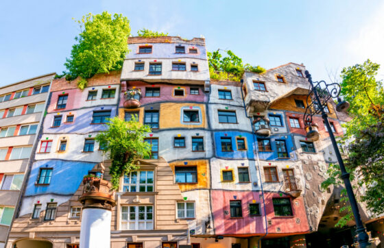
Feel at home in colour
Pink – is it really girly, or has society just attached that meaning to it, condemning it to a sugary-sweet world of girls’ fashion and toys? Is red really the colour of aggression, passion, and danger? Is black really bleak, full of grief and darkness? And what about brown? Is it just another mashed-up sort of nothing colour, like grey? This is an article about colours – where they come from, what they mean, and how you can use them in your home.
A colourful debate
The past has seen many a heated argument about colours and their origins. Is colour inside us, in our perceptions and feelings? Or is colour found in the light that falls on everything we see around us? In their correspondence, luminaries Goethe and Isaac Newton argued fiercely about what, today, we would consider quite the non-issue. Goethe maintained that colour exists in our perceptions and the environment (shadow, shade, bright light), while Newton held that colours existed in light.
The origin of colour
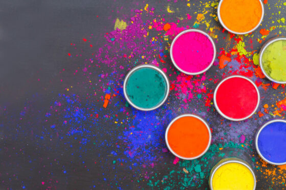
So, where does colour come from? It exists both in light and in materials. For centuries, people made colours with pigments that came from the strangest of places. What about dragon’s blood, for instance? This is a deep-red resin that can be obtained from various trees and turns a deep orange-red – the presumed colour of dragon’s blood – when it comes into contact with oxygen. Prussian blue is a beautiful dark-blue colour that, unfortunately, is also poisonous. It was discovered by accident when a Berlin paint manufacturer by the name of Johan Diesbach mixed oxblood with iron, expecting a red colour. Imagine his surprise when the mixture turned into a beautiful shade of blue instead! Some other colours were more straightforward to create, such as Sienna and Umber. These colours were made in Italy by grinding burnt earth into a powder, which, when mixed with linseed oil, produced rich oil paints.
People have ground plants, earth, and minerals to create colours, but because the resulting dyes and pigments were often sensitive to light, they would quickly change colour or fade entirely. These days, we almost always use synthetic pigments in paint. Next time you’re at a DIY shop and see hundreds of colours of paint, remember that it took us centuries to get to this point.
What colours mean
This article opened with a quick look at the psychology of colour, asking whether black is really is bleak or whether that’s just a cultural construct. What does colour actually do to us? German author Eva Heller tries to answer this question in her weighty tome on the subject, titled Wie Farben Wirken (Rowohlt Verlag GmbH, Hamburg 1989).
In the book, she shares the following substantiated meanings of some colours:
Orange: cheap, modern, intrusive, pleasure, brings to mind an old phone network or maybe the Dutch national football team.
Pink: cute, tender, soft, feminine.
Green: calming, hope, poison.
Blue: everlasting loyalty, deceit.
Red: love, hate.
Black: conservatism, anarchy, elegance, death.
Yellow: gold, rejection.
Purple: power, immorality.
Gold: luck and so much more.
Brown: secret love, stupidity.
Grey: mediocrity, boredom.
Silver: enchantment, second place.
The fun really starts when you look up what different colour combinations mean. Colours used in packaging come to mind – why is semi-skimmed milk green, for example, while whole milk is blue? Why is hazelnut chocolate green but dark chocolate purple? Dutch chocolate company Tony’s Chocolonely wanted to have some fun with this and mixed things up a little, selling chocolate in wrappers with a colour you associate with a different flavour. In some countries, trains are yellow with blue stripes, and for good reason –the contrast they produce is highly visible in most lighting conditions.
Mixing
There are two ways to mix colours: subtractively and additively. Subtractive mixing is what you do with paint: you mix colours together to get a new one. If you keep going, and add all the colours, you’ll end up with a kind of deep brown. Additive mixing is done with light and involves building up different layers of projected light. If you keep going, you’ll always end up with white light.
To conclude: using colours
You can play around with colours in your home. Choosing opposing colours lets you create contrasts, which can be so striking that it may seem as though one colour is closer to your eye than the other. Blue and red are a good example. Just try it and see for yourself – cut a square of bright-blue paper or cardboard, and then a smaller square of bright red and place it on top of the blue. Now take a step back and look at the colours. The red square will look like it’s floating, separate from its background. Origin and meaning aside, colours will always be very personal. Whatever colour or colours you settle on, make sure they’re ones you like. Like Elizabeth Sweetheart, who always wears green – or even Esmee in our office, who absolutely adores pink!